
Aanisha | Designs
Health Chakra
June 2025
Redesigning the homepage and how the users book their appointment.

Background
I worked on redesigning the website for Health Chakra Pvt Ltd, a startup digital and in-person oral health clinic in India. Even though the clinic already has a strong reputation in person, the current website felt a bit disjointed. The founder was particularly keen on updating the landing page, and the redesign overall aims to reflect the company’s updated structure, processes, and services.
Team Involved: Founder, Project Manager, Front-End Developers
My role
Researcher
UX Designer
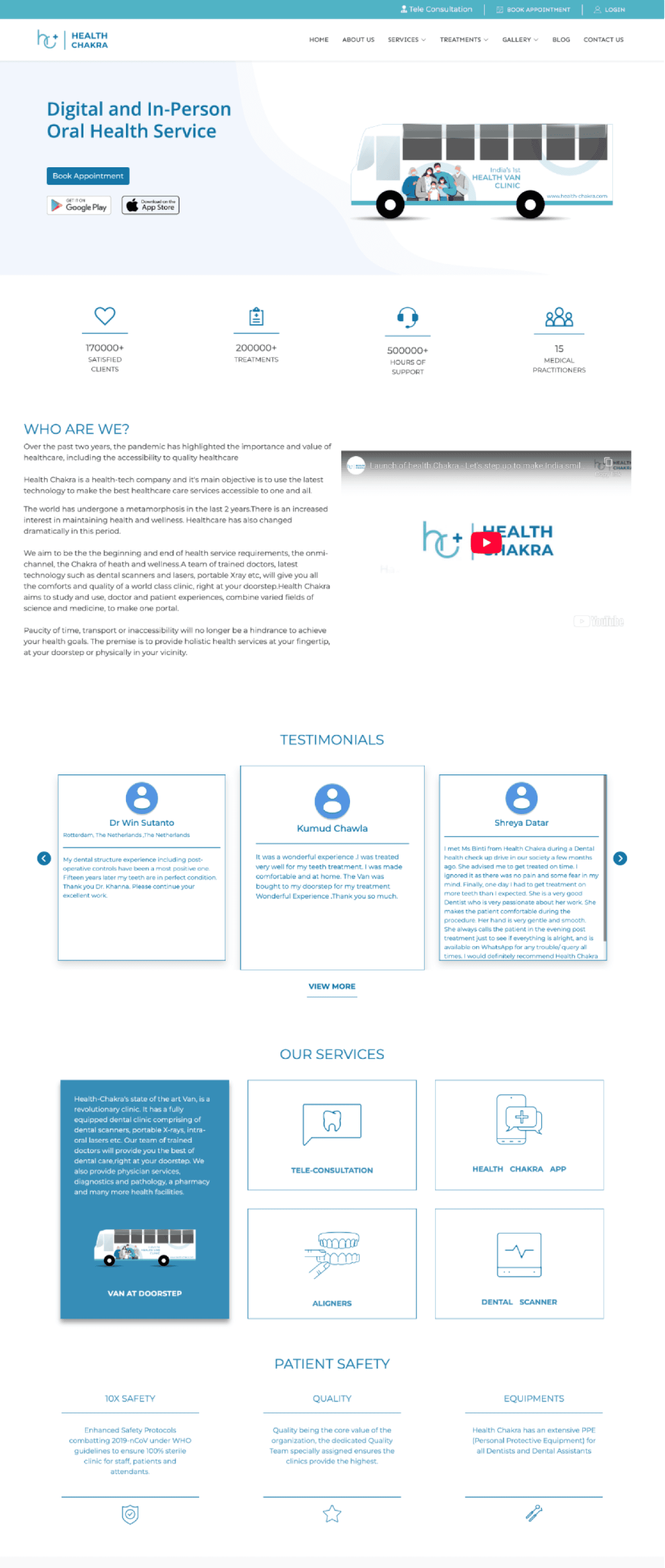
Current Homepage
After an intial meeting with the business stakeholders, they mentioned the following areas of concern:
Low task completion rate online at >1%
Users default to calling the reception
Self-service usage rate is > 0.3% as users are unable to find the service they seek
Users on average are satisfied with the service provided, but avoid using the website and app.
Project Goal
My goal was to improve the clarity and transparency of healthcare services by providing clear service descriptions, intuitive booking and rescheduling journeys, enabling users to confidently access and manage their care.
Research
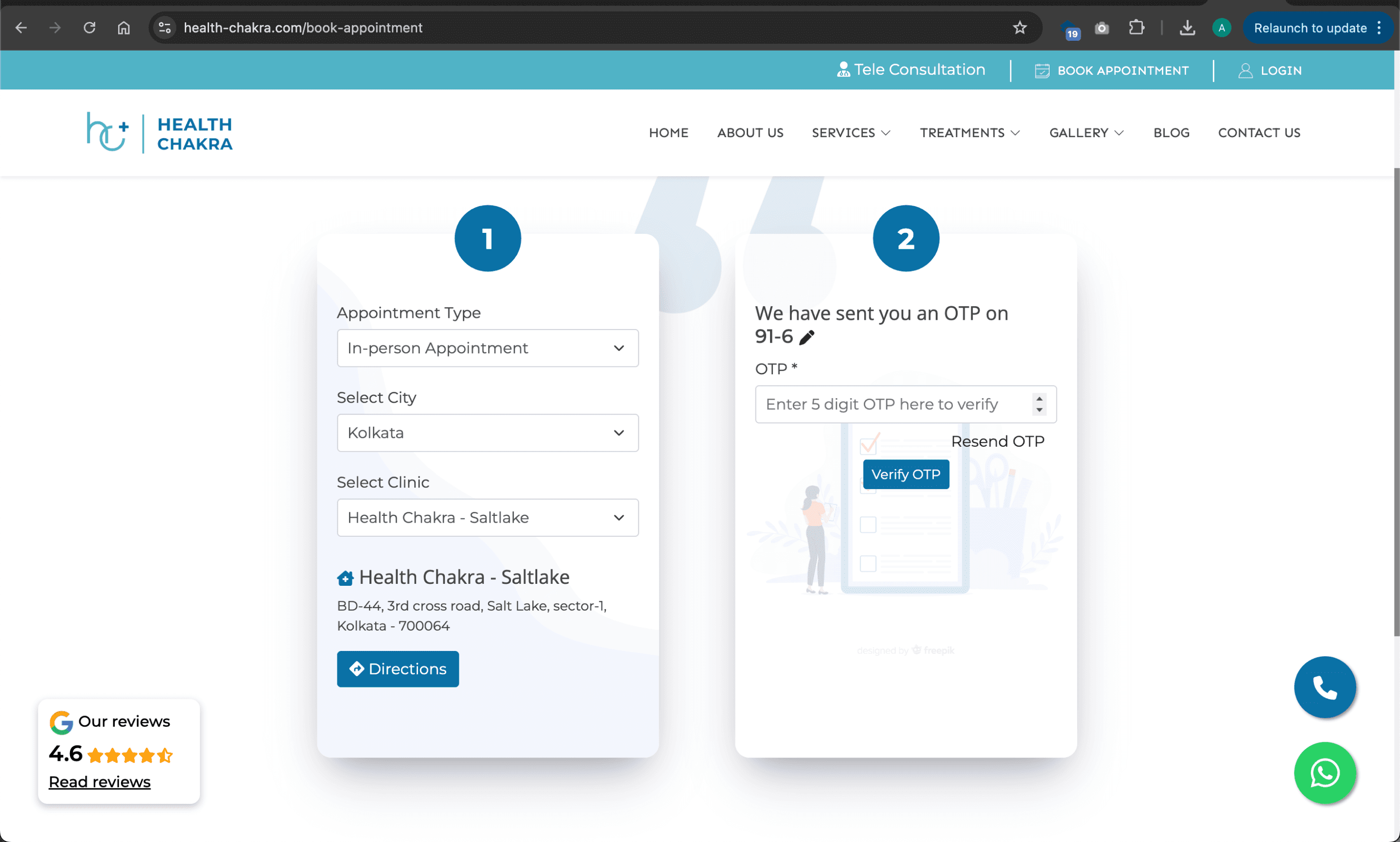
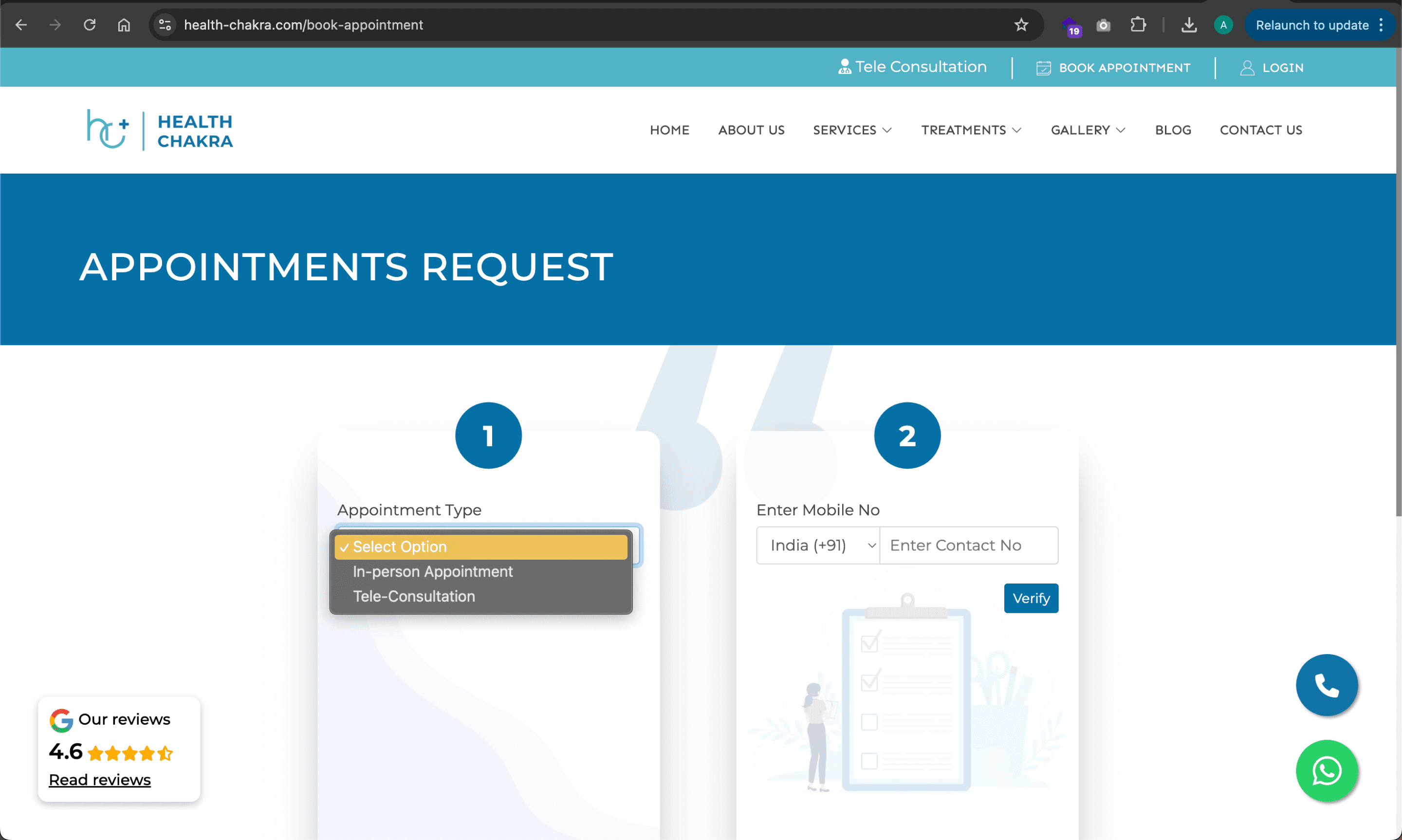
When conducting interviews, I noticed a recurring theme of frustrations linked with the existing booking system. Interestingly, patients and the staff found that "Booking an Appointment" should be straightforward, but were continuously faced with various issues including not being able to find availabilities, lack of confirmation message and being able to book on behalf of someone else.
Key Action Items
User Experience & Accessibility
I focused on creating simple, intuitive navigation and a clear booking process. I wanted to make sure the service flow felt seamless across teleconsultations, van visits, and in-clinic appointments. Desktop optimisation was key, especially for older or less tech-savvy users.Technical Functionality
From a technical perspective, I noticed that booking edits, slot visibility, and confirmation processes could be improved. Telehealth usability was also a challenge, often due to tech gaps or unclear flows. Throughout, I relied on metrics like conversion, drop-off, and support queries to evaluate what was working and where improvements were needed.
Personas
Individual user

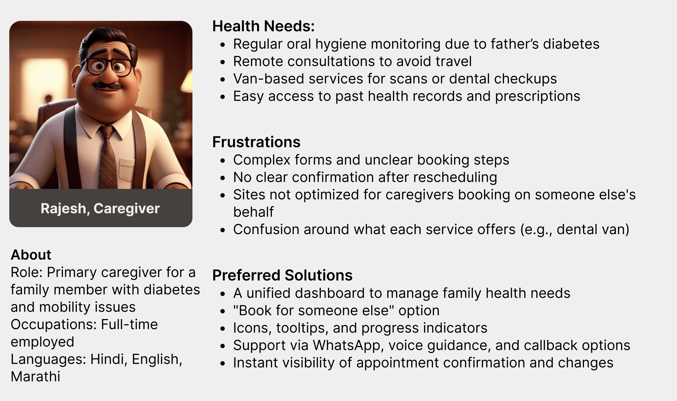
The caregiver
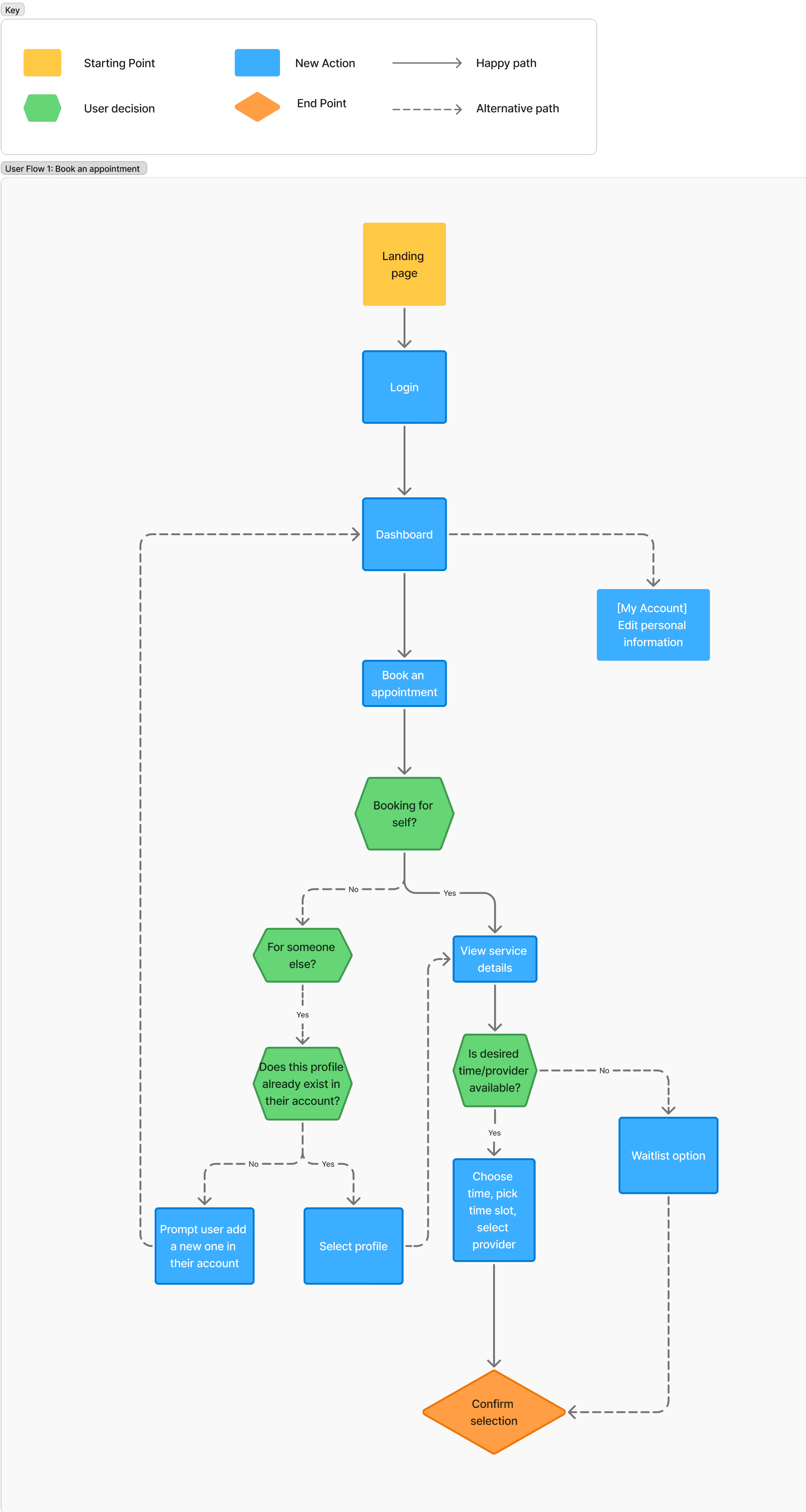
Flow Chart
I designed the user flow to take the experience a step beyond the original business requirements. During the interviews, I kept hearing the same issues: users struggled to book appointments, ran into technical glitches with the information shown, and often had to call the clinic to get things done.
When I spoke with the doctors, they mentioned the same thing — patients were constantly calling in to book appointments. It made me realise just how much smoother that journey needed to be for everyone.
The Design Process
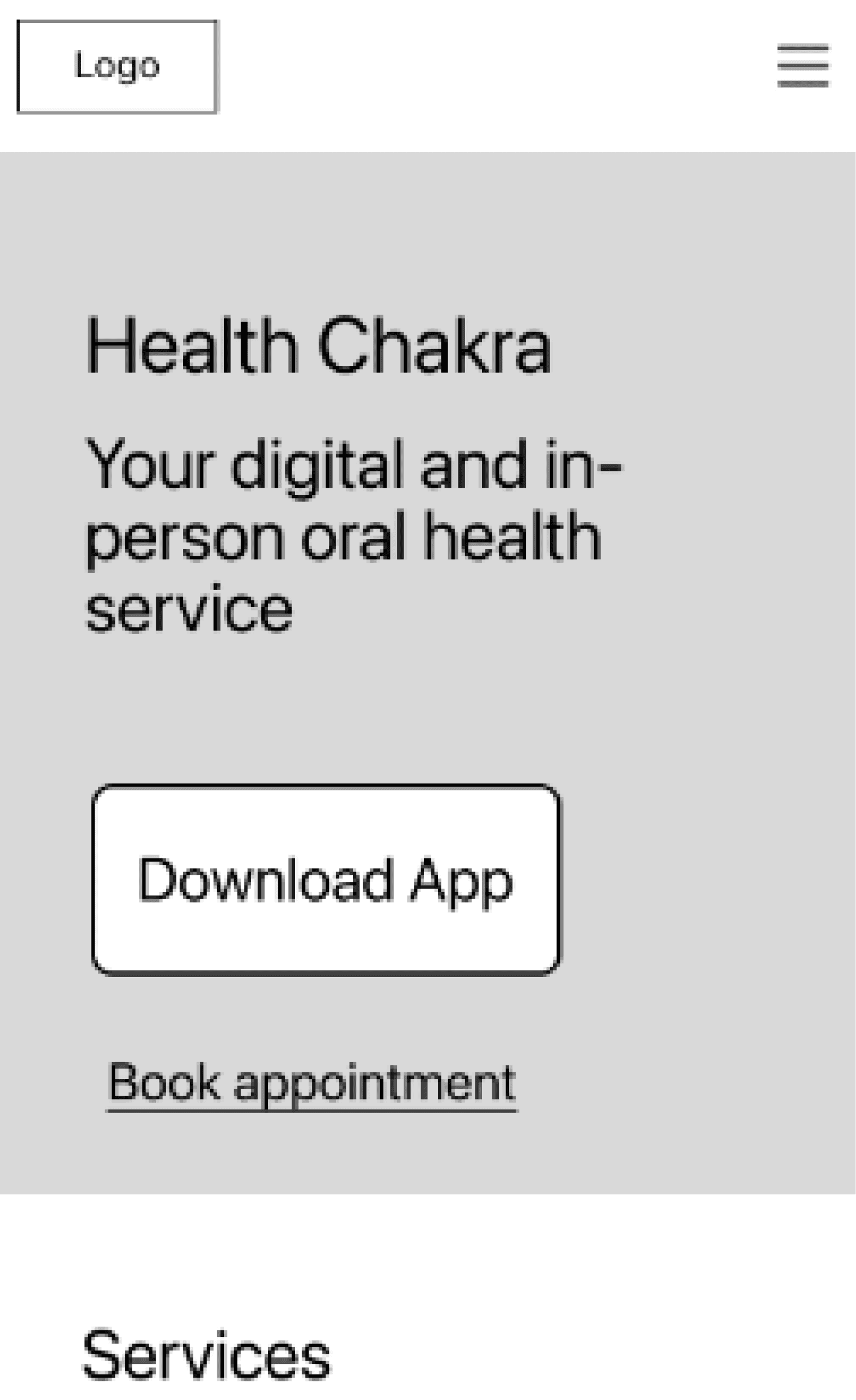
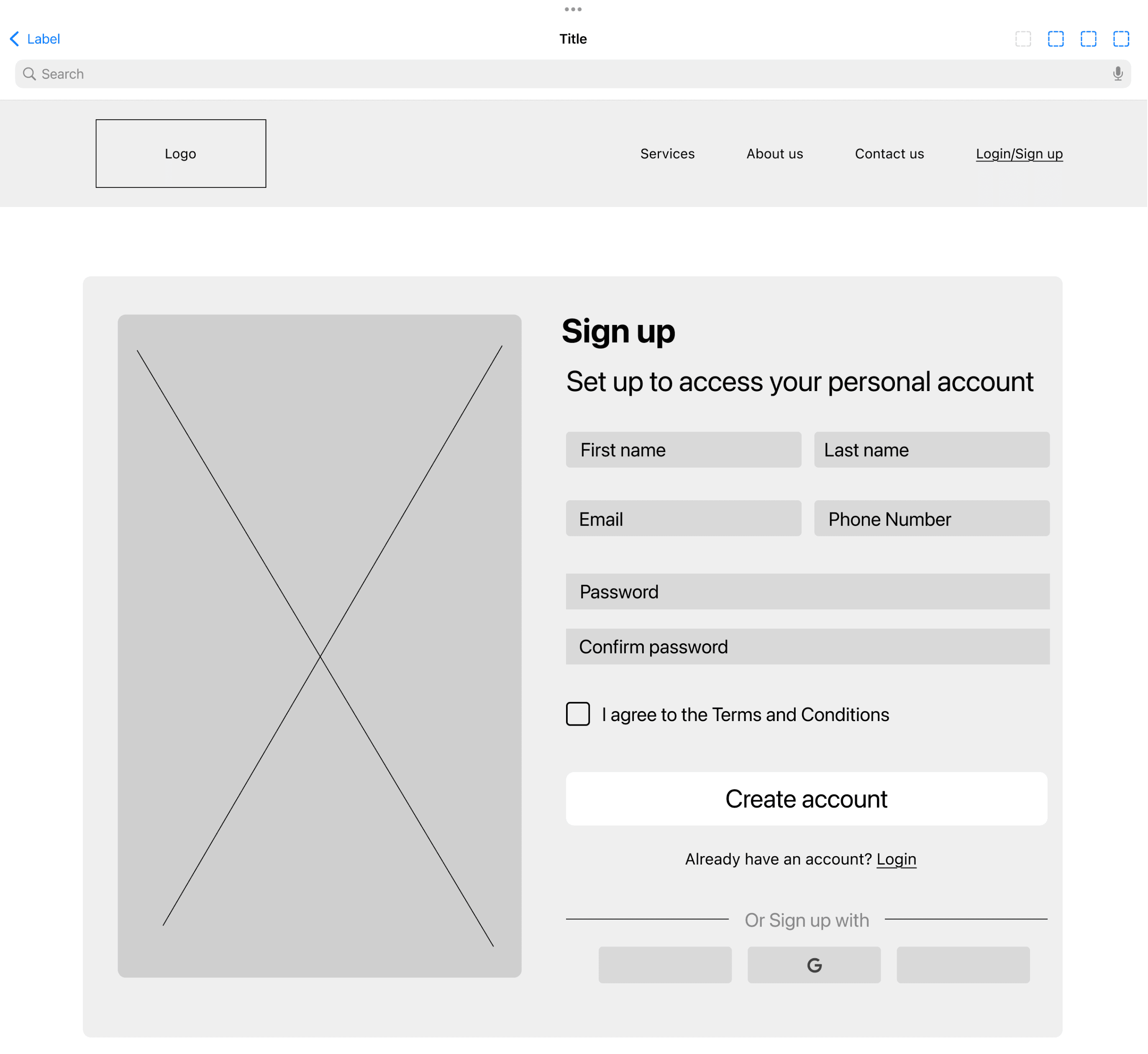
Low-fidelity Wireframes
I was working closely with the business throughout this process to ensure I was meeting the business requirements. The business stakeholders were happy with my approach but wanted to ensure a clean, easy-to-use approach was taken.
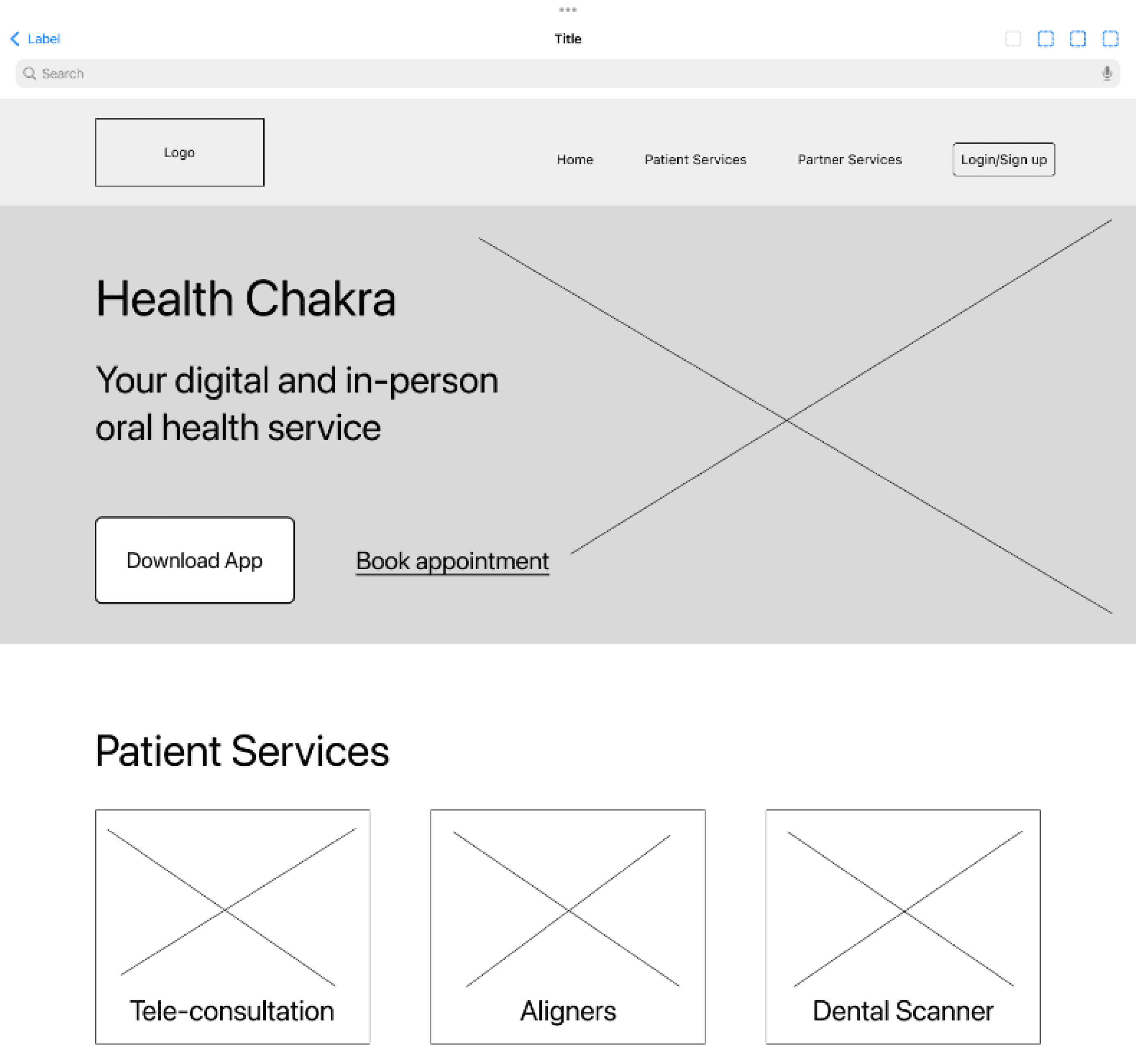
Mid-fidelity Wireframes
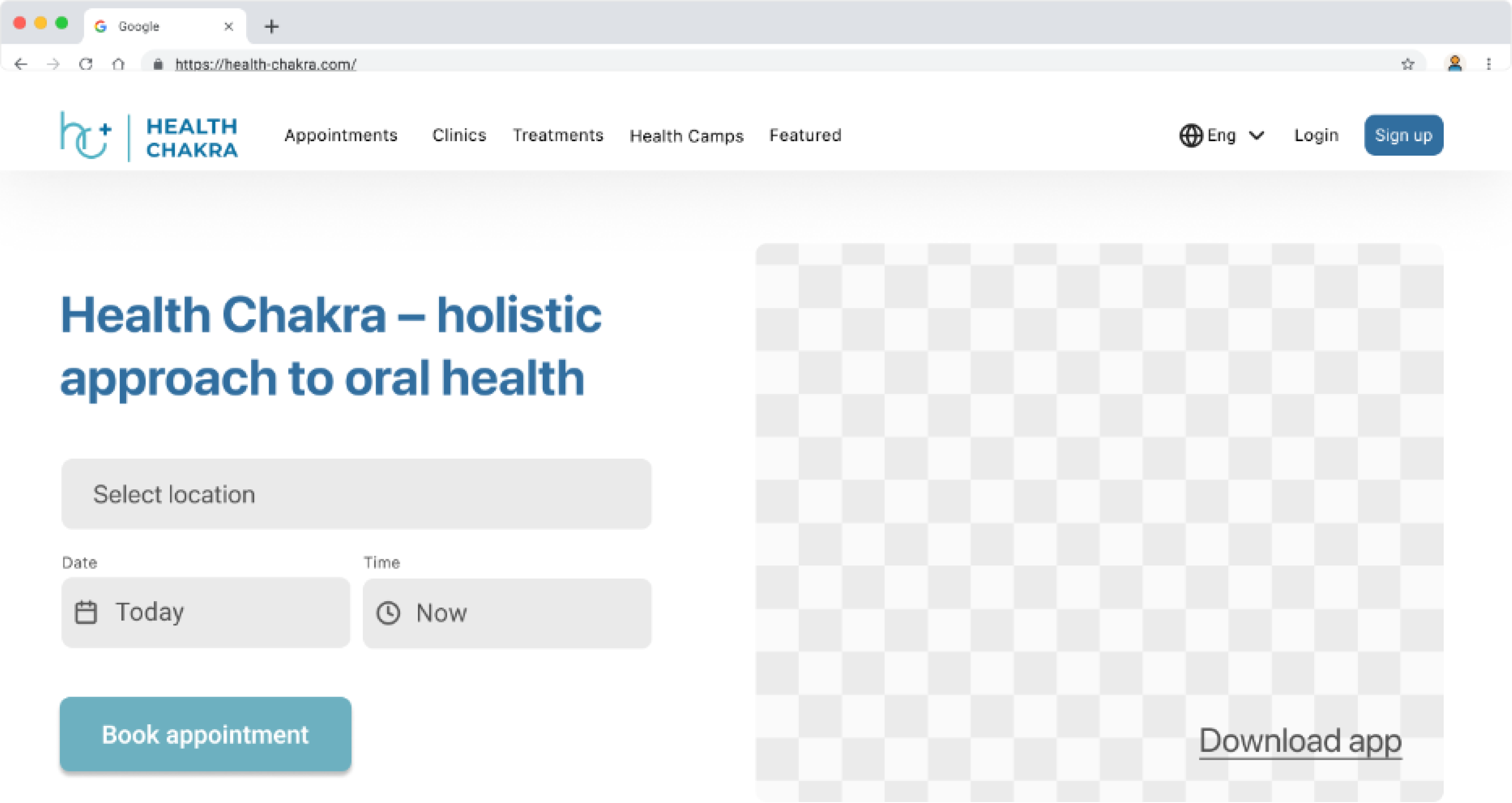
I prioritised tablet landing page as users prefer using a larger when completing any task such as booking an appointment.
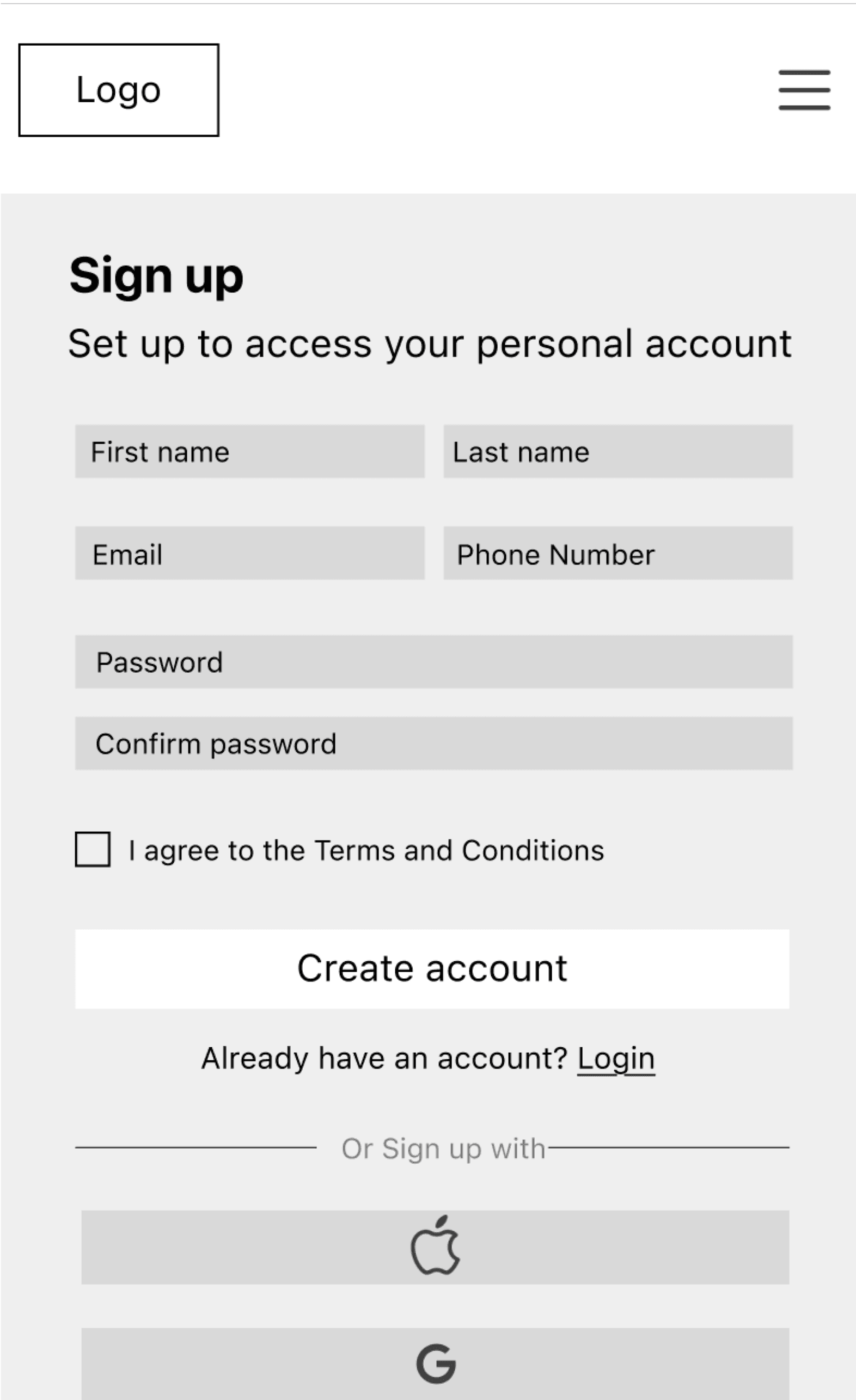
Prototype Screens
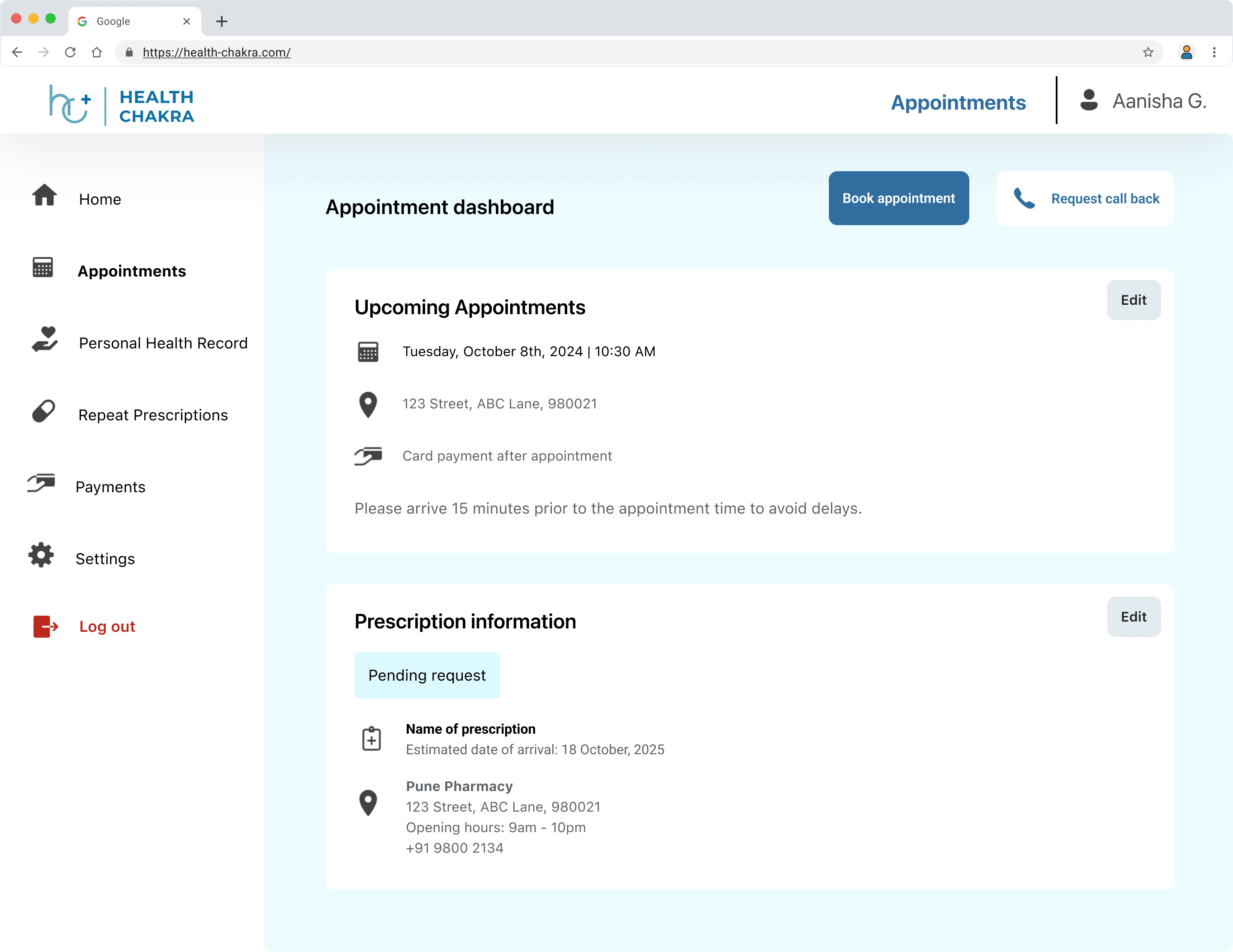
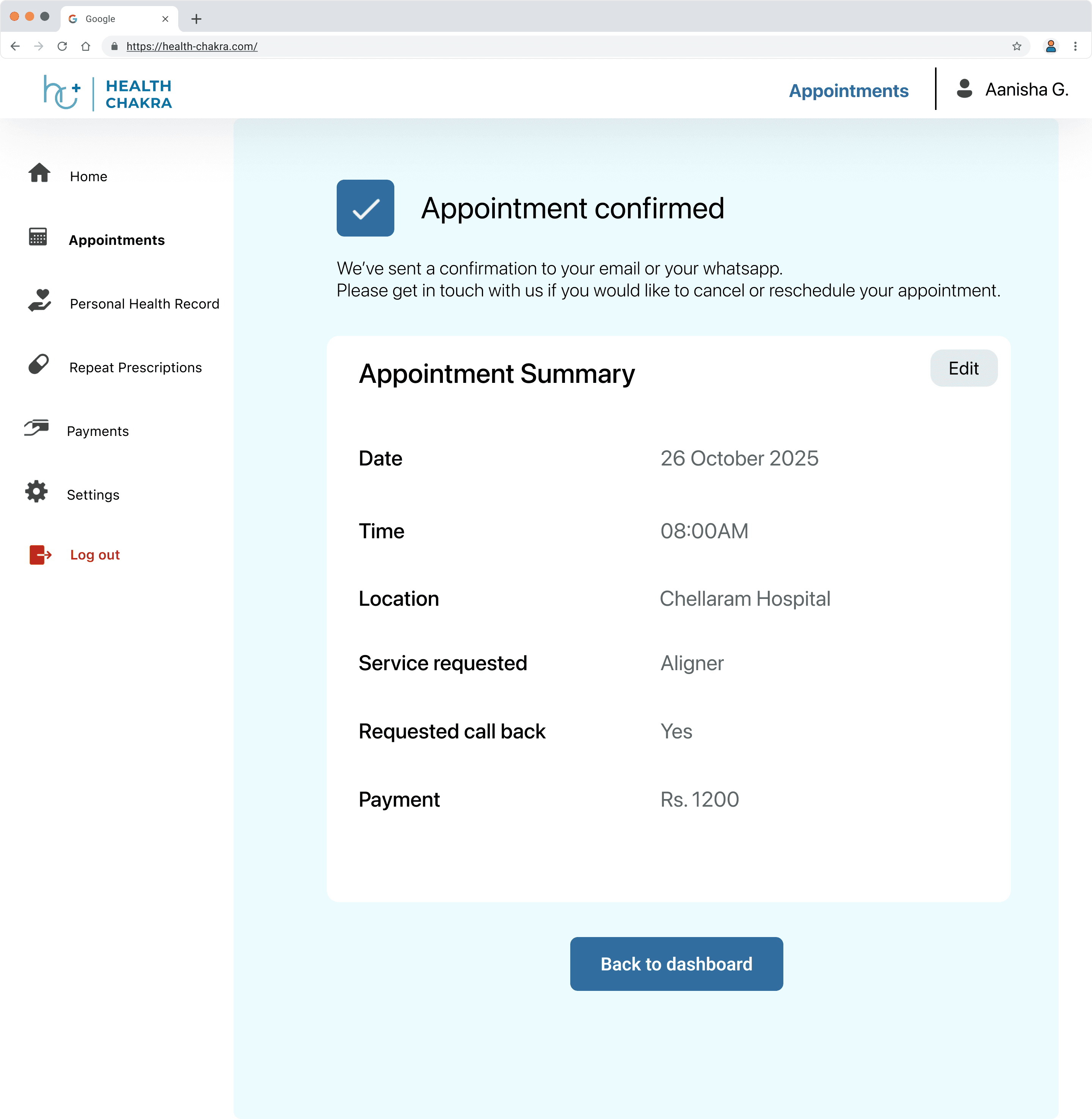
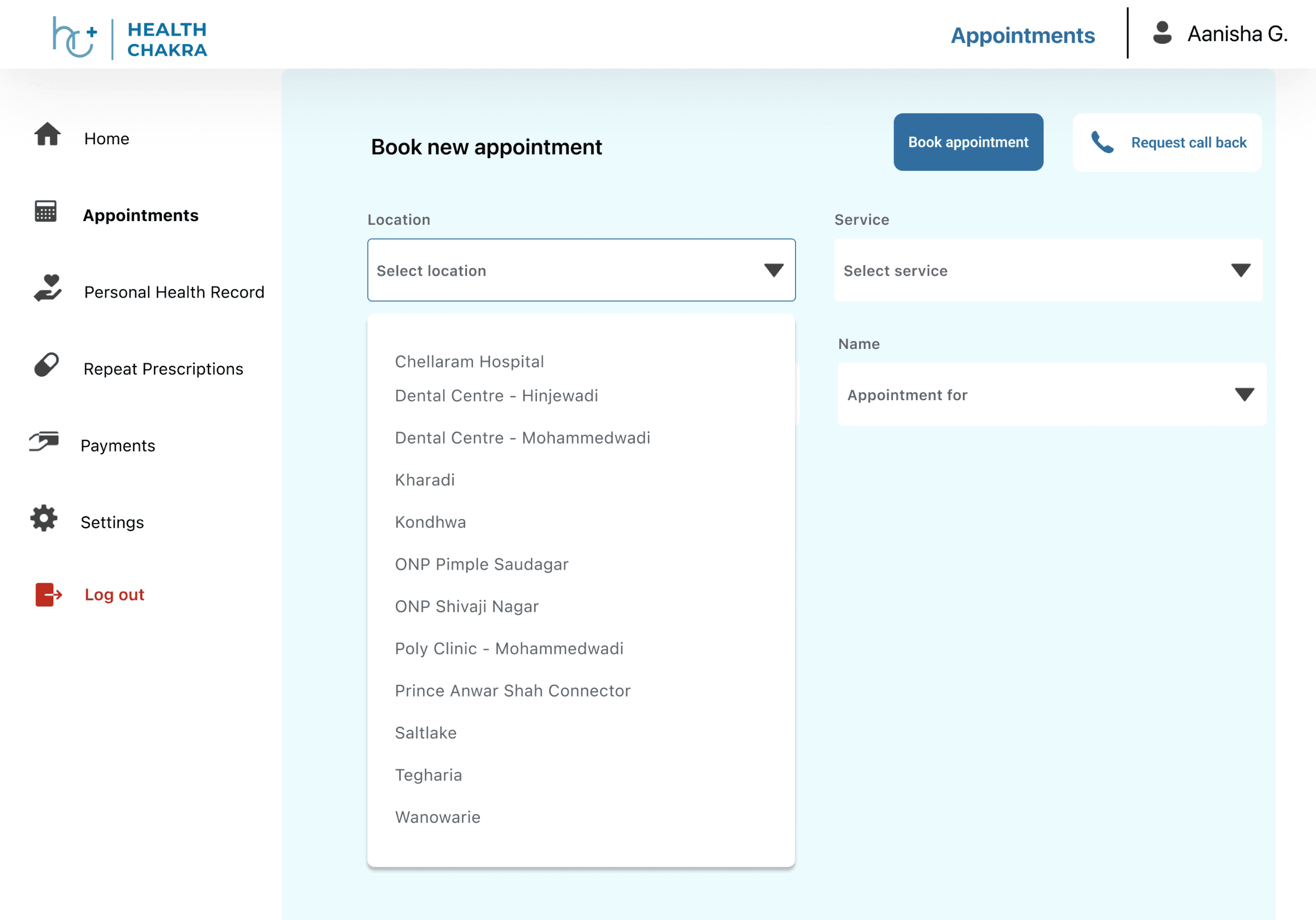
A page I added for ease of navigation was an appointment-specific dashboard. This included:
An easy process for the users to book an appointment
Centralised source of information
And clear access to personal information
Desired outcome:
Fewer calls for support
Easy to navigate and complete task
Testing and Iterations:
Visual Design & Layout
I wanted the layout and branding to feel modern, clean layout with improved spacing and clear visual hierarchy.
I was also implementing the brand's colour palette for a consistent look and feel.
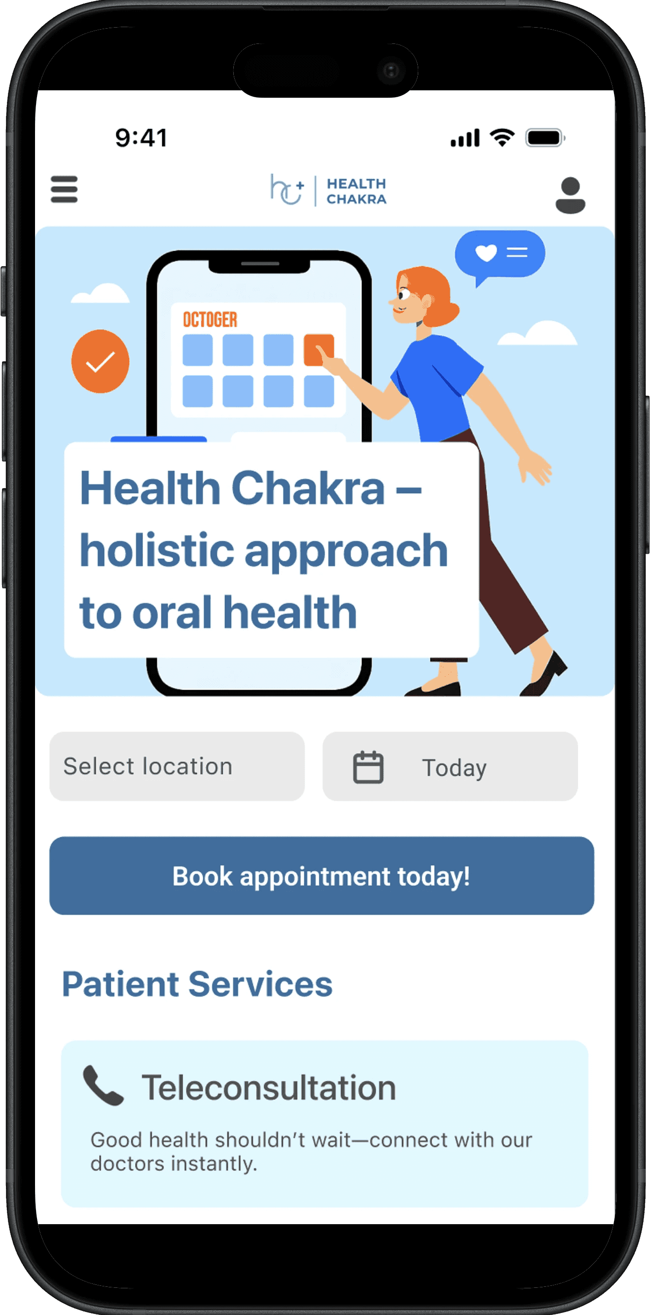
Hero Section
From the interviews conducted and usability testing, clear healthcare-focused tagline that strengthens brand positioning was important.
Patient Services
It was important to design scannable, icon-based service grid for quick understanding and so I reduced a lot of the visual clutter and copy-heavy sections.
Provide concise descriptions replacing dense text blocks
Before
Updated version
Before
Updated version
Key Insights
Many users in India preferred human interaction at several points during the booking journey and relied heavily on phone calls or WhatsApp for reassurance – an interesting discovery during the iteration process. In response, I made sure the design offered multiple opportunities to contact the support team or request a call-back — ensuring users always felt supported while using the platform.